Purple America
In seeking meaning last week's election, I shy away from reductionist explanations in favor of interpretations that encompass more data and offer more shades of meaning. Which is why I recommend spending some time pondering the 2006 Purple America map by Robert Vanderbei of Princeton, in which the election results are presented, not as red or blue, but as shades of purple:
 Note the changes from the 2004 map:
 I don't know of any other graphic summary that so aptly represents the choices of millions of voters.
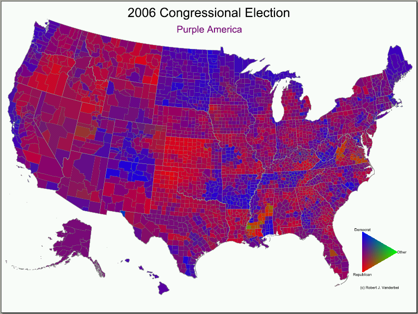 Note the changes from the 2004 map:
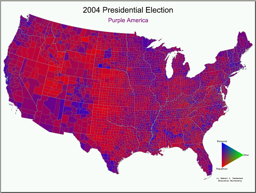 I don't know of any other graphic summary that so aptly represents the choices of millions of voters.
posted by Tom Noyes at 11:56 AM
![]()
![]()


0 Comments:
Post a Comment
<< Home